Showing posts with label cross browser compatibility. Show all posts

Tuesday, June 26, 2012

CSS Opacity, IE Filter, Binary and Script Behaviors

(This article is about using IE specific "filter" to mimic the standard CSS attribute "opacity", this mimicry's consequence when the Binary and Script Behaviors setting is disabled in IE8 and IE7, and the workaround.)

CSS is not rocket science, but nonetheless difficult due to the infamous browser-compatibility issue. Any experienced web developer will tell you that CSS is a mess. The CSS standard doesn't look very complicate on paper, however, in reality, there are always some corner cases that break your UI in certain browsers (most likely IE). Some of such corner cases are well documented and mind-shared in the web developer community, however, some of them are not so well known, lurking there to ambush you.

I got ambushed today by such corner case. This corner case is so nasty that it cannot be reproduced in most browser settings. Here is the story:

Opacity is a standard CSS attribute invented to control transparency of HTML elements. However, not so surprisingly, IE under version 9 doesn't support "opacity". To fix that, most articles returned by Google search will recommend adding "filter" -- a IE specific attribute to mimic "opacity".

#trans {
  opacity: 0.4;
  filter: alpha(opacity=40); /* For IE8 and earlier */
}

Snippet 1

The above snippet I partially copied from w3schools.com (link) works in most browser settings. Actually, it works so well that most web developers won't have to worry about it in their lifetime.

My application is a third-party web app. It works in a tight security environment in which IT built up a fortress to fend off any possibly suspicious activity. One of such suspicious activities is using ActiveX.

"""
The Microsoft Windows Server 2003 Internet Explorer Enhanced Security Configuration component (also known as Microsoft Internet Explorer hardening) reduces a server’s vulnerability to attacks from Web content by applying more restrictive Internet Explorer security settings that disable scripts, ActiveX components, and file downloads for resources in the Internet security zone.
"""
(If you really want to read the full explanation, here is the original article)

This IE security setting is called "Binary and Script Behaviors" under the "ActiveX controls and plug-ins" category.


Figure 1

This setting is disabled in my case, which means using ActiveX is not an option. Now, you must wonder why this has anything to do with CSS opacity?

The "filter" attribute actually relies on ActiveX in order to mimic "opacity" in IE8 and below (discussed in stackoverflow). When the "Binary and Script Behaviors" setting is disabled, ActiveX became unavailable and the filter trick stopped working.

In Snippet 1, the filter is set to "alpha(opacity=40)", but when the "Binary and Script Behaviors" setting is disabled, filter will be ignored; and if background color is black, you will see a solid black instead of a semi-transparent black.


Figure 2

To reproduce this issue in IE8, first, you need to remove your app from the Trusted Sites (Figure 3). Then, disable "Binary and Script Behaviors" (See Figure 1).


Figure 3

The workaround is to set the "background-image" attribute to a semi-transparent PNG only for IE 7 to 8.

#trans {
  opacity: 0.4;
  /* filter: alpha(opacity=40); <-- Remove filter */
}
body.ie7 #trans, 
body.ie8 #trans {
  background: transparent url(/images/opacity40_black.png);
}
Snippet 2
The above CSS works with the following conditional body tags for marking IE versions.
<!--[if lt IE 7 ]><body class="ie6"><![endif]-->
<!--[if IE 7 ]><body class="ie7"><![endif]-->
<!--[if IE 8 ]><body class="ie8"><![endif]-->
<!--[if IE 9 ]><body class="ie9"><![endif]-->
<!--[if gt IE 9 ]><body class="ie10"><![endif]-->
<!--[if !IE]>--><body class="not-ie"><!--<![endif]-->
Snippet 3
To create a semi-transparent PNG, there are millions of PNG editing tools out there, but I found this free online generator is sufficient: Transparent PNG generator.

Tuesday, April 3, 2012

CSS3 Transition: Slideup Box (Take 2)

Demo and source code

This post is to propose a better solution for creating an expandable/slideup box. My previous implementation has a flaw -- the fixed "max-height" truncate part of the content when its height grows. This solution will resolve this issue.

First, we have the following markup.

<article>
  <h2>Click me to expand</h2>
  <div class="content_w">
    <div class="content">
      Lorem ipsum dolor sit amet, consectetur adipisicing elit, sed do 
      eiusmod tempor incididunt ut labore et dolore magna aliqua. Ut 
      enim ad minim veniam, quis nostrud exercitation ullamco laboris 
      nisi ut aliquip ex ea commodo consequat...
    </div>
  </div>
</article>

When users click inside an <article>, the content area will slide down (expand) or slide up (collapse). The title (<h2>) will always be visible.

The idea is to wrap the content inside a wrapper (div.content_w). The wrapper will hide any overflown content. We will change the height of the wrapper to create a slide up/down effect.

article .content_w {
  overflow: hidden;
  height: 0;
}
article .content_w.transition {
  -webkit-transition: height 0.5s;
     -moz-transition: height 0.5s;
       -o-transition: height 0.5s;
          transition: height 0.5s;
}

The wrapper needs to have "overflow: hidden" in order to clip the overflown content. We set "height: 0" to collapse the box initially.

The transition will take effect on the wrapper's height. When the box needs to be collapsed, we set the wrapper's height to 0. CSS3 transition will smoothly slide up the box. When expanding (sliding down), we set the wrapper's height back to the height of its enclosed content.

$('article').on('click', function() {
  slide($('.content', this)); 
});

function slide(content) {
  var wrapper = content.parent();
  var contentHeight = content.outerHeight(true);
  var wrapperHeight = wrapper.height();

  wrapper.toggleClass('open');
  if (wrapper.hasClass('open')) {
    setTimeout(function() {
      wrapper.addClass('transition').css('height', contentHeight);
    }, 10);
  }
  else {
    setTimeout(function() {
      wrapper.css('height', wrapperHeight);
      setTimeout(function() {
        wrapper.addClass('transition').css('height', 0);
      }, 10);
    }, 10);
  }

  wrapper.one('transitionEnd webkitTransitionEnd transitionend oTransitionEnd msTransitionEnd', function() {
    if(wrapper.hasClass('open')) {
      wrapper.removeClass('transition').css('height', 'auto');
    }
  });
}

The trick is that we don't want to keep a fixed height on the wrapper when it finishes expanding. A fixed height will clip its content when it grows, or leave unnecessary space at the bottom when the content shrinks. To fix that, we need to set height back to "auto" in order to "relax" the height. However, setting "height: auto" on HTML elements with CSS3 transition will make the transition have no effect. We have to remove transitions before setting "height: auto".

Demo and source code

Tested in Chrome, Safari, FireFox, and Opera Mobile Emulator


Saturday, March 31, 2012

Sliding / Expandable / Collapsible Box with max-height CSS Transition

Note


An improved solution can be found in this post.


Source code and demo

One common CSS3 Transition is to slide up (collapse) and slide down (expand) a box by manipulating its "height" attribute, e.g. changing 400px to 0. However, when either height is set to "auto", the transition won't work anymore. This topic has been discussed here.

The solution is to change the "max-height" instead of "height". Max-height is a CSS attribute supported in almost all modern browsers (see compatibility chart here). It defines the maximum height of an element. We can use it to "shrink" a box by setting max-height to 0, or expand a box by restoring its original height. In order to restore the original height, we need to retain the computed height of the box content.

Adam at stackoverflow.com provided a solution inspired by this same idea. I simplified the solution by removing some of the JavaScript code.

HTML markup


Here I create an item (div.item) with a title (<h2>) and content area (div.content). I want to make the content area slide down (expand) or slide up (collapse) once the item is clicked. The title will always be visible.

<div class="item">
    <!-- Title -->
    <h2>Click me to expand</h2> 

    <!-- Content wrapper -->
    <div class="content_w"> 

        <!-- Content -->
        <div class="content"> 
            Lorem ipsum dolor sit amet, consectetur adipisicing elit, 
            sed do eiusmod tempor incididunt ut labore et dolore 
            magna aliqua. Ut enim ad minim veniam, quis nostrud 
            exercitation ullamco laboris nisi ut aliquip ...
        </div>
    </div>
</div>

I put the content div inside a wrapper (div.content_w). Instead of changing the max-height of the real content div, we change the wrapper's. This way, we can achieve the sliding up/down effect while still retaining the computed height of the real content div.

Style sheet


Here is the style sheet. Please notice that the max-height and transition are set on the content wrapper rather than the content itself. The content will remain unchanged no matter if the wrapper is collapsed or expanded. The content wrapper needs to have "overflow: hidden" in order to hide its contained content when the wrappers's height becomes less than the content's.

.item {
    width: 400px;
}

/* Content wrapper */
.content_w {
    overflow: hidden;
    max-height: 0;
    -webkit-transition: max-height 0.5s;
       -moz-transition: max-height 0.5s;
         -o-transition: max-height 0.5s;
            transition: max-height 0.5s;
}

JavaScript


With a little help from jQuery, I toggle the max-height between 0 and the content height based on the "open" class which I use simply to mark the expanded and collapsed state.

(function($) {

  // max-height transition. 
  // Inspired by http://jsfiddle.net/adambiggs/MAbD3/
  function toggleContent($contentWrapper) {
    // Get the computed height of the content
    var contentHeight = $('.content', $contentWrapper).outerHeight(true);

    // Add or remove class "open"
    $contentWrapper.toggleClass('open');

    // Set max-height
    if ($contentWrapper.hasClass('open')) {
      $contentWrapper.css('max-height', contentHeight);
    }
    else {
      $contentWrapper.css('max-height', 0);
    }
  }

  // Listen to click events on the item element 
  $('.item').on('click', function(e) {
    e.preventDefault();

    toggleContent($('.content_w', this)); 
  });

})(jQuery);​

One thing to notice is that I didn't use jQuery to do the transition. The transition is done by CSS. jQuery is used only for selecting DOM elements, marking elements, and applying CSS styles. You can replace jQuery with any of your favorite JavaScript libraries.

Limitations


The max-height is set to the content height when it is expanded. So if the content changes or re-flows later, some content will be clipped. The extra code that Adam put there is to prevent this by setting max-height to a really big number at the end of the expand transition. However, if you need a simple slideup box whose content and layout won't change after expansion, then this solution should work fine for you.

An improved solution can be found in this post.

Saturday, October 15, 2011

Working with YUI2 Data Table and Script Node Data Source

Data Table might be one of the most powerful widgets in the YUI2 library. It supports column formatter, sorter, pagination, column resizing, column reordering, and most importantly, data binding. Like other YUI2 widgets, Data Table is able to utilize YUI's universal Data Source APIs to bind data to UI components. You just specify where the data comes from, how the data looks like, and which UI parts to bind certain pieces of data. The Data Source will do the heavy lifting for you. It takes care of sending/retrieving data, parsing data, and feeding parsed data to the associated widget. Pretty powerful stuff.

In this article, I will demonstrate how to use YUI DataTable and DataSource to create a page that lets users search client records by client's first name, last name, and ID. If any client record is found, we display the search results in a table on the same page.

For DataSource, I use ScriptNodeDataSource. One of the major advantages of the ScriptNodeDataSource is that its data requests can be sent across domains by using JSONP (JSON Padding) instead of XHR. More discussions about JSONP can be found here.

First, let's define a ScriptNodeDataSource and response schema.

// Setup remote data source
var ds = new YAHOO.util.ScriptNodeDataSource(
    'http://www.anotherdomain.com/search/');

// The response JSON will have a results array
// Each result object has userId, firstName, lastName, birthDate, 
// address1, address2, address3, city, state, and zip properties.
ds.responseSchema = {
    resultsList: "results", 
    fields: [ "userId", "firstName", "lastName", "birthDate", 
        "address1", "address2", "address3", "city", "state", "zip" ]
};

Define table columns. Use column formatters for column name, date, and address. Sort table rows by names.

//
// Column formatters
//

// Format column Name
var formatName = function(elCell, oRecord, oColumn, oData) {
    // Concat the last name and first name
    var strName = oRecord.getData("lastName") + ", " 
        + oRecord.getData("firstName");

    // Wrap name in a link that goes to client details page
    var strUserId = oRecord.getData("userId");
    elCell.innerHTML = '<a href="' + getResultUrl(strUserId) 
        + '">' + strName + '</a>';
};

// Format column DOB
var formatDate = function(elCell, oRecord, oColumn, oData) {
    if (YAHOO.lang.isString(oData))
    {
        if (Y.env.ua.ie > 0)
        {
            // IE has problem to parse date string "yyyy-mm-ddT00:00:00"
            // Here, we fall back to manipulating the date string
            elCell.innerHTML = oData.split("T")[0].replace(/-/g, "/");
        }
        else
        {
            var oDate = new Date(oData);
            elCell.innerHTML = oDate.format("mm/dd/yyyy");
        }
    }
};

// Format column Address
var formatAddress = function(elCell, oRecord, oColumn, oData) {
    var strAddr = oRecord.getData("address1") + " "
        + oRecord.getData("address2") + " " 
        + oRecord.getData("address3");
    strAddr = strAddr.trim() + ", " + oRecord.getData("city") + ", " 
        + oRecord.getData("state") + " " + oRecord.getData("zip");

    elCell.innerHTML = strAddr;
};

//
// Sorters
//

// Sort by name
var sortName = function(a, b, desc) {
    var fnComp = YAHOO.util.Sort.compare;
    var compState = fnComp(a.getData("lastName"), 
            b.getData("lastName"), desc);
    if (compState == 0)
    {
        compState = fnComp(a.getData("firstName"), 
            b.getData("firstName"), desc);
    }

    return compState;
};

// Column definitions
var colDefs = [ 
    { 
        key: "name", label: "Name", 
        resizeable: true, sortable: true, 
        formatter: formatName, // formatName column formatter
        width: 120, 
        sortOptions: { sortFunction: sortName } // sortName sort function
    }, 

    {
        key: "address", label: "Address", 
        resizeable: true, sortable: true, 
        formatter: formatAddress, // formatAddress column formatter
        width: 250
    },

    {
        key: "birthDate", label: "DOB", 
        resizeable: true, sortable: true, 
        formatter: formatDate // formatDate column formatter
    },

    {
        key: "userId", label: "Client ID", 
        resizeable: true, sortable: true
    }
];

Setup table configuration. When the table is created, the data table will send out an initial request to get data. We want to capture this initial request, and prevent the server side from starting any search work, because at this moment our user hasn't filled any search keywords in the text fields yet (First Name, Last Name, and Client ID text fields). The initial request is not triggered by our users. It has to be filtered out. To do this, we append "&init=true" parameter to the initial request's URL so the server side will know.

// Table configurations
var tableCfg = {
    initialRequest: "&init=true", 
    sortedBy: {
        key: "name", dir: "asc"
    }, 
    width: "100%", 
    height: "30em", 
    MSG_LOADING: "", 
    MSG_EMPTY: ""
};

The beef is here --- the search function which is responsible of gathering user inputs, validation, clearing previous search results in the table, constructing search queries, sending out query requests, displaying returned results, and handling errors.

// Field validation
var validate = function(params)
{
    // Validation logics go here ...

    return true;
};

// Search function. 
// It will be invoked when users click the "Search" button
var fnSearch = function(e) {

    // Suppress form submission
    YAHOO.util.Event.stopEvent(e);

    // Get search field values
    var params = {
        "firstName": document.getElementById("firstName").value,
        "lastName": document.getElementById("lastName").value,
        "userId": document.getElementById("userId").value
    };

    // Field validations
    if (validate(params) == false)
    {
        return false;
    }

    // Callbacks for datasource.sendRequest  
    var callbacks = {
        success: function(oRequest, oParsedResponse, oPayload) {
            console.log("Retrieved search results");

            // Enable the table
            table.undisable();
    
            // Flush and update the table content
            table.onDataReturnInitializeTable.apply(table, arguments);

            // Sort by name in ascending order
            table.sortColumn(table.getColumn("name"), 
                YAHOO.widget.DataTable.CLASS_ASC);

            // Update the count of search results
            document.getElementById("results-count").innerHTML = 
                " - " + oParsedResponse.results.length + " result(s)";
        },

        failure: function() {
            console.log("Failed to get search results");

            // Failure handling code
        },

        scope: table
    };

    // Delete any existing rows, clear result count, 
    // and disable the table
    table.deleteRows(0, table.getRecordSet().getLength());
    document.getElementById("results-count").innerHTML = "";
    table.disable();

    // Construct search query
    var strQuery = "";
    for(var key in params)
    {
        strQuery += "&" + key + "=" + params[key].trim();
    }

    // Send out query request
    ds.sendRequest(strQuery, callbacks);
    console.log("Data source sent out request");

    return false;
};

Hook up the search function with the button click event. And finally, create the table.

YAHOO.util.Event.addListener("search-btn", "click", fnSearch);

// Construct data table. Pass in column definitions, data source, 
// and table configuration
var table = new YAHOO.widget.ScrollingDataTable("results-table", 
    colDefs, ds, tableCfg); 
console.log("Constructed data table");

Wednesday, September 1, 2010

IE6 multi class CSS selector weirdness

1. Problem


Multi class CSS selectors such as ".green.bold" (no space between) are commonly used in modern web styling. However, whenever you have something fun to play, IE6 comes to ruin it.

.bold { font-weight: bold; }
.green.bold { color: green; }
.blue.bold { color: blue; }

<p class="bold green">
    Green and bold
</p>
<p class="bold blue">
    Blue and bold
</p>

In other browsers such as FireFox, the above CSS and HTML will be rendered like this:

Green and bold

Blue and bold

Now, be prepared for IE6 weirdness:

Green and bold

Blue and bold

That is how IE6 renders the above CSS. Let's take a closer look. Both lines are bold. That's right. However, the first line should be green instead of blue.

Although I don't have an official answer for this behavior, I found a theory to explain how IE6 CSS parser works in this case. This is just my theory. I haven't verified it against any W3C documents.

2. Theory


The way that IE6 parses these ".green.bold" and ".blue.bold" CSS selectors can be explained like this:

When IE6 runs to multi class selectors, e.g. ".green.bold", IE6 will only recognize the last class which is "bold". The preceding classes such as "green" will be ignored.

.green.bold { ... }

The above CSS rule will be parsed as

.bold { ... }

Now let's re-examine the CSS rules at the beginning of this article.

.bold { font-weight: bold; }
.green.bold { color: green; }
.blue.bold { color: blue; }

For IE6, this will be equivalent to:

.bold { font-weight: bold; }
.bold { color: green; }
.bold { color: blue; }

Please notice the last 2 lines. ".bold { color: green; }" precedes ".bold { color: blue; }", so blue overwrites green. However, "font-weight: bold" in the first CSS rule doesn't get overwritten due to the fact that later CSS rules don't define any font weights.

The above CSS can be further simplified to:

.bold { font-weight: bold; color: blue; }

With the "parsed" CSS, now we understand why IE6 rendered our CSS and HTML into two blue bold lines.

To prove my theory, I change the CSS rules a bit:

.bold { font-weight: bold; }
.green.bold { color: green; font-size: 24px; }
.blue.bold { color: blue; }

".green.bold" has font size set to 24px. Let's try to walk through it like what IE6 CSS parser works.

Step 1:
.bold { font-weight: bold; }
.bold { color: green; font-size: 24px; }
.bold { color: blue; }

Step 2:
.bold { font-weight: bold; color: green; font-size: 24px; }
.bold { color: blue; }

Step 3:
.bold { font-weight: bold; color: blue; font-size: 24px; }

Try this in IE6, the result will be like this.

Green and bold

Blue and bold

3. Solution


How do we fix this IE6 weirdness?

Because IE6 honors only the last class in a multi class selector, we can move the more specific class to last. So here we swapped "green" and "bold":

.bold { font-weight: bold; }
.bold.green { color: green; font-size: 24px; }
.bold.blue { color: blue; }

For IE6, this will be parsed as:
.bold { font-weight: bold; }
.green { color: green; font-size: 24px; }
.blue { color: blue; }

Now the result became:

Green and bold

Blue and bold

However, in real world, things won't be this simple. For example, this solution won't work in the 3-class case, e.g. ".class1.class2.class3". The styles that class2 defines will be lost. unless you copy the styles from class2 to class3, and thus equivalently make it a 2-class selector: .class1.class3

HTML Box model, IE, and 100% width

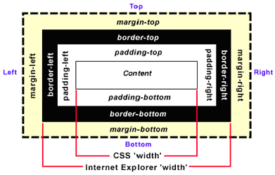
A HTML box has margin, border, and padding surrounding its content area.  According to the W3C specification, 'width' and 'height' CSS attributes only define the width and height of the content area, not the box itself.  The box's padding, border, and margin are not considered to be parts of the content area.

So the following CSS rule will render a 150-pixel wide and heigh 'myBox' DIV, although its CSS width and height are set to 100 pixels:

#myBox {
    width: 100px;
    height: 100px;
    padding: 10px;
    border: 5px;
    margin: 10px;
}

box width = width + 2 * (padding + border + margin) = 100 + 2 * (10 + 5 + 10) = 150

However, IE decides to have its own box model. IE includes padding and border (not margin) in width and height. So the above CSS rule will produce a 120-pixel wide and heigh box.

box width = width + 2 * margin = 100 + 2 * 10 = 120

Because the CSS width (100px) already includes padding (10px) and border (5px), the box's content area will be squeezed from 100 pixels to 70 pixels.

content width = width - 2 * (padding + border) = 100 - 2 * (10 + 5) = 70

This weird behavior can be fixed by declaring a doc type.

<!DOCTYPE html PUBLIC "-//W3C//DTD XHTML 1.0 Transitional//EN"
"http://www.w3.org/TR/xhtml1/DTD/xhtml1-transitional.dtd">

The above doc type will force IE to honor the W3C standard, and apply CSS width only to the content area.

The standard W3C box model will give you headaches if you are not careful. For example, we want a box to have a 100% width and 10-pixel padding.

#myBox {
    width: 100%;
    padding: 10px;
}

This CSS rule makes the width of "myBox" 100% of its ancestor container. Let's say myBox's parent container has a 400-pixel box width. Since the myBox's width is 100%, it will be 100% of its parent's 400px width, so you might think that the width will be 400 pixels. Is it true? What about the padding?

The actual width will be 400px plus 20px.

box width = 100% of parent's box width + 2 * padding = 100% * 400 + 2 * 10 = 420

420 might not be what you want because it will be wider than its parent. In real word, this issue might screw up your layout. To fix this problem, add an inner DIV inside myBox.

<div id="myBox">
    <div id="innerBox">
    </div>
</div>

And divide the above CSS rule to two:

#myBox {
    width: 100%;
}
#innerBox {
    padding: 10px;
    /* Or you can use margin */
}

This will make sure that the innerBox has 10px paddings and still fits in the 400px wide myBox.

The rule of thumb is not to mix percents with paddings or margins.

Further reading on the box model: The Box Model Problem