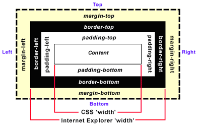
So the following CSS rule will render a 150-pixel wide and heigh 'myBox' DIV, although its CSS width and height are set to 100 pixels:
#myBox {
    width: 100px;
    height: 100px;
    padding: 10px;
    border: 5px;
    margin: 10px;
}
box width = width + 2 * (padding + border + margin) = 100 + 2 * (10 + 5 + 10) = 150
However, IE decides to have its own box model. IE includes padding and border (not margin) in width and height. So the above CSS rule will produce a 120-pixel wide and heigh box.
box width = width + 2 * margin = 100 + 2 * 10 = 120
Because the CSS width (100px) already includes padding (10px) and border (5px), the box's content area will be squeezed from 100 pixels to 70 pixels.
content width = width - 2 * (padding + border) = 100 - 2 * (10 + 5) = 70
This weird behavior can be fixed by declaring a doc type.
<!DOCTYPE html PUBLIC "-//W3C//DTD XHTML 1.0 Transitional//EN"
"http://www.w3.org/TR/xhtml1/DTD/xhtml1-transitional.dtd">
The above doc type will force IE to honor the W3C standard, and apply CSS width only to the content area.
The standard W3C box model will give you headaches if you are not careful. For example, we want a box to have a 100% width and 10-pixel padding.
#myBox {
    width: 100%;
    padding: 10px;
}
This CSS rule makes the width of "myBox" 100% of its ancestor container. Let's say myBox's parent container has a 400-pixel box width. Since the myBox's width is 100%, it will be 100% of its parent's 400px width, so you might think that the width will be 400 pixels. Is it true? What about the padding?
The actual width will be 400px plus 20px.
box width = 100% of parent's box width + 2 * padding = 100% * 400 + 2 * 10 = 420
420 might not be what you want because it will be wider than its parent. In real word, this issue might screw up your layout. To fix this problem, add an inner DIV inside myBox.
<div id="myBox">
    <div id="innerBox">
    </div>
</div>
And divide the above CSS rule to two:
#myBox {
    width: 100%;
}
#innerBox {
    padding: 10px;
    /* Or you can use margin */
}
This will make sure that the innerBox has 10px paddings and still fits in the 400px wide myBox.
The rule of thumb is not to mix percents with paddings or margins.
Further reading on the box model: The Box Model Problem
No comments:
Post a Comment